Pairing Colors for Knitters
On September 9, Shannon Cook of Very Shannon invited me to write a post on her blog as part of her Summer Sweater Knit Along 2015. Here is the original version of this post.
Introduction by Shannon:
“I love color! Color can be such a fun & exciting way to show off & add your personality to your knitting! Pairing colors is such an adventure and I figured who better than to teach us for Summer Sweater Knit Along 2015 about color combinations, stripes & more than the lovely Julie Asselin herself! I swear when I think of Julie I see color! She’s a bright, loving and energetic soul and I adore her!
She’s been a long time sponsor of our knit alongs (her yarns are to dye for!) and I knew she would have so much fun popping in today to chat about one of her favourite subjects! Her palette of yarn colors ranges from muted & scrumptious to bright and unapologetically bold and I love it! You can see all her colorways here.
I’m super excited for this post – it’s filled with lots of helpful information and even it’s very own Pinterest board! You can easily find it and other resources, guest posts & more on our Tips + Techniques Page. So let’s get learning! Here’s Julie…”
KNITTERS PAIRING COLORS – WHAT MAKES A COLOR COMBO GO FROM OK TO AMAZING!
Color relativity: The receptiveness of a color to the influence of a neighbouring color- how much its appearance is subject to alteration by another color.
I LOVE colors, we all wear them, expressing ourselves and sending messages about how we feel and how we want to be perceived. Even for those of us who mostly knit with neutrals, theres always a little color in there as theres probably an undertone hidden somewhere in that favorite grey of yours.
Theres a million things to be said about colors and a million different voices to be heard as we all see colors differently and we all respond differently both physically and psychologically to them.
If I say ‘Red’, everybody reading this will see a different color, even if I am trying to be more specific by saying ‘Crimson red’ you will most likely see a different color then I do.
We are influenced by many things when it comes to colors, why we love or hate a color is due in part to the context in which we are used to seeing in and with what we associate it with.
It is up to you to tell me if red is the color of love or the color of hate. I am always blown away when I start digging into what colors do to us and how we choose to use them in our lives. Isn’t this super exciting?
Colors and knitting go hand in hand as we must choose yarn to knit with, therefore choose a color. Today I wanted to give you pointers and tips about choosing color combos for stripes and colorwork, understanding why sometimes we see a color combination and go: ‘Wow this project is the prettiest I have ever seen!’ or when knitting a project thinking ‘Hum…I like it but…maybe I could have come up with something better’.
Now that being said we all have our own sense of style and taste and what we are going to talk about today is not about how I feel about colors but more about how they interact together and making sure we convey the right feel and make our project stand out.
CREATING + CHOOSING COLOR COMBINATIONS
Color combination for colorwork is a bit different then choosing colors for stripes.
When doing colorwork we want our motifs to pop and the scenery we are knitting with our colors to give a striking effect to the piece. Stripes are more ‘forgiving’ as we dont have small stitches that need to stand out so the stricking effect is less important in that case.
Before we continue this discussion, I’ve put together a Pinterest board on color theory and I invite you to brush up on basic color theory and pairing.
Now which color should I choose for my colorwork project? How many colors do I need? Is the colorwork depicting something precise like leafs or animals? Is it more abstract? Do I want it to be true to real life colors or do i want to go more on the wild side? Who is it for?
You now want to think about tints (adding white), tones (addidng grey) and shades (adding black) to bring richness and thinking into all this. I know maybe this seem like a lot to take into consideration, but let me give you a very cool trick.
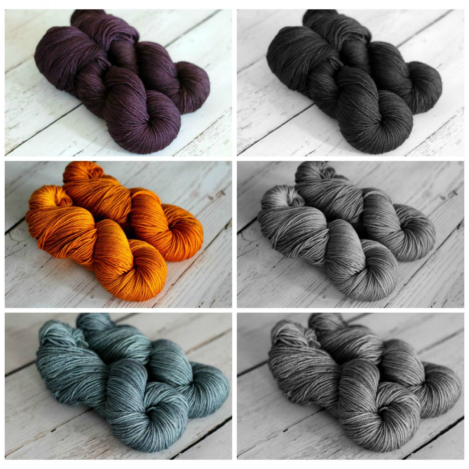
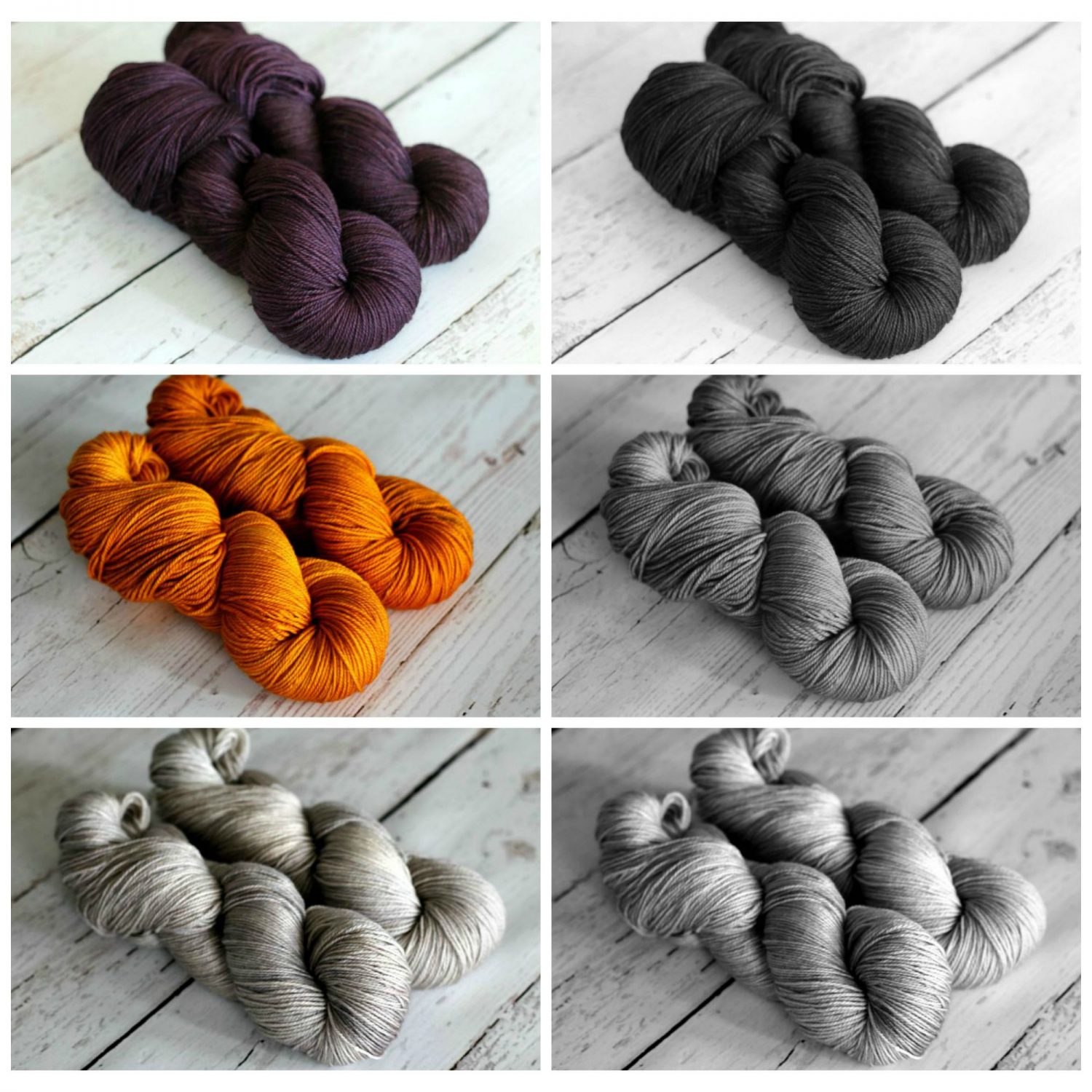
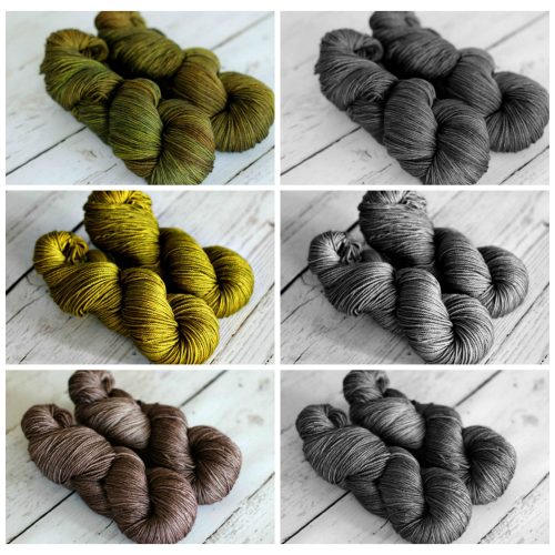
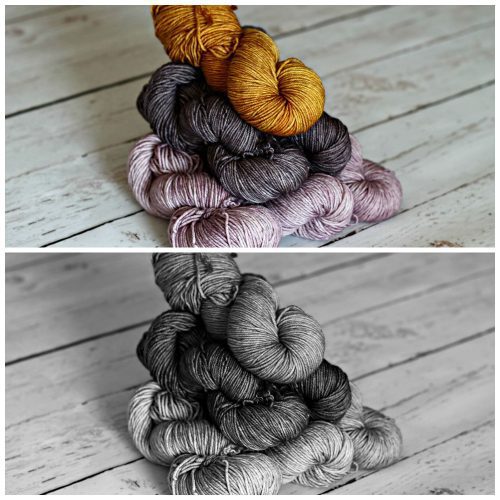
Put together a color combo that you like, take a picture with your phone or camera and change it to black and white. It is now easier to see the values of each colors. For colorwork projects you want to have colors of very different values; as we said earlier, the motif needs to pop and have clear stitch definition.
Depending on how many colors you are using and what kind of colorwork you are knitting you want to use colors that are on the semi-solid side of of things rather then being more varigated.
It is so instructive to see that some colors that we thought would be of great contrast are in fact not that much.
STRIPES
Theres 2 predominent patterns in my closet, polka dots and stripes (with a bit of floral and ikat /abstract added to the mix!). Stripes are in everyones closet and choosing colors,distribution,width and placement for them when knitting is a lot of fun!
What you could be thinking about when planning stripes:
How many colors do you want? Do you want your stripes to stand out or to be more subdued? Like I said previously while different values in colors will bring interest you definetly can go on the softer side here since theres no motif to bring out.
Lets look at those color combo I’ve put together earlier, maby not enough contrast for colorwork but definetly rocking for stripes. Something to think about if you want a color to stand out is, why not ‘frame it’ with a row or two above and below of a strong contrast color?
Do you want stripes all over or just at the bottom of the body and sleeves? Delicate ones at the yoke? When doing this think about the idea that warmer, brighter, lighter colors come forward and cooler, duller, darker colors fade back (also applies to colorwork)
Another interesting thing is to think not only about colors but also about stripes width. Theres many ways and formulas to go about this but the one I like to use is the Fibonacci sequence.
It translate into knitting stripes as follow: stripes width are expressed in numbers of rows, the Fibonacci sequence make it so that all numbers present are the sum of the 2 numbers coming before them. Ex : 2-3-5 or 3-5-8. Adding to that you could be going for a 3 different width stripes sequence and a 5 color combo making width and color mixing together.
Is it just me or we are having so much fun?!? Lastly I find that a great thing to do is to look at your color combination while using the proportions in which you will use the colors.
I hope that this session made you want to try a thing or two and got you thinking about your favorite colors, how they translate into your knitting and what you could do to change things up a bit.
Happy knitting to everyone, and now that I have written a first post about color theory I have other ideas that come to mind that I can’t wait to share with you, a huge thanks to you Shannon for letting me write on here.
Until next time!
